

Our Services
The challenge? A modernized website with a strong visual identity to engage the user with donations, educational resources and SCBC’s campaigns. Deconstructing existing user activity with their current website would help us formulate our UX approach, ultimately increasing user engagement. In addition, it was important for the SCBC media team to be able to update their content independently, with intuitive and easy to use page-builder functionality. Working with their existing integrations was critical in supporting their operations, with a large database of valuable posts that needed to be migrated.

For ease of client onboarding, we decided to use WordPress, leveraging its custom post types to sort out content hierarchy quickly and easily. Training their media team to use our established system for content entry provided for a collaborative handoff.
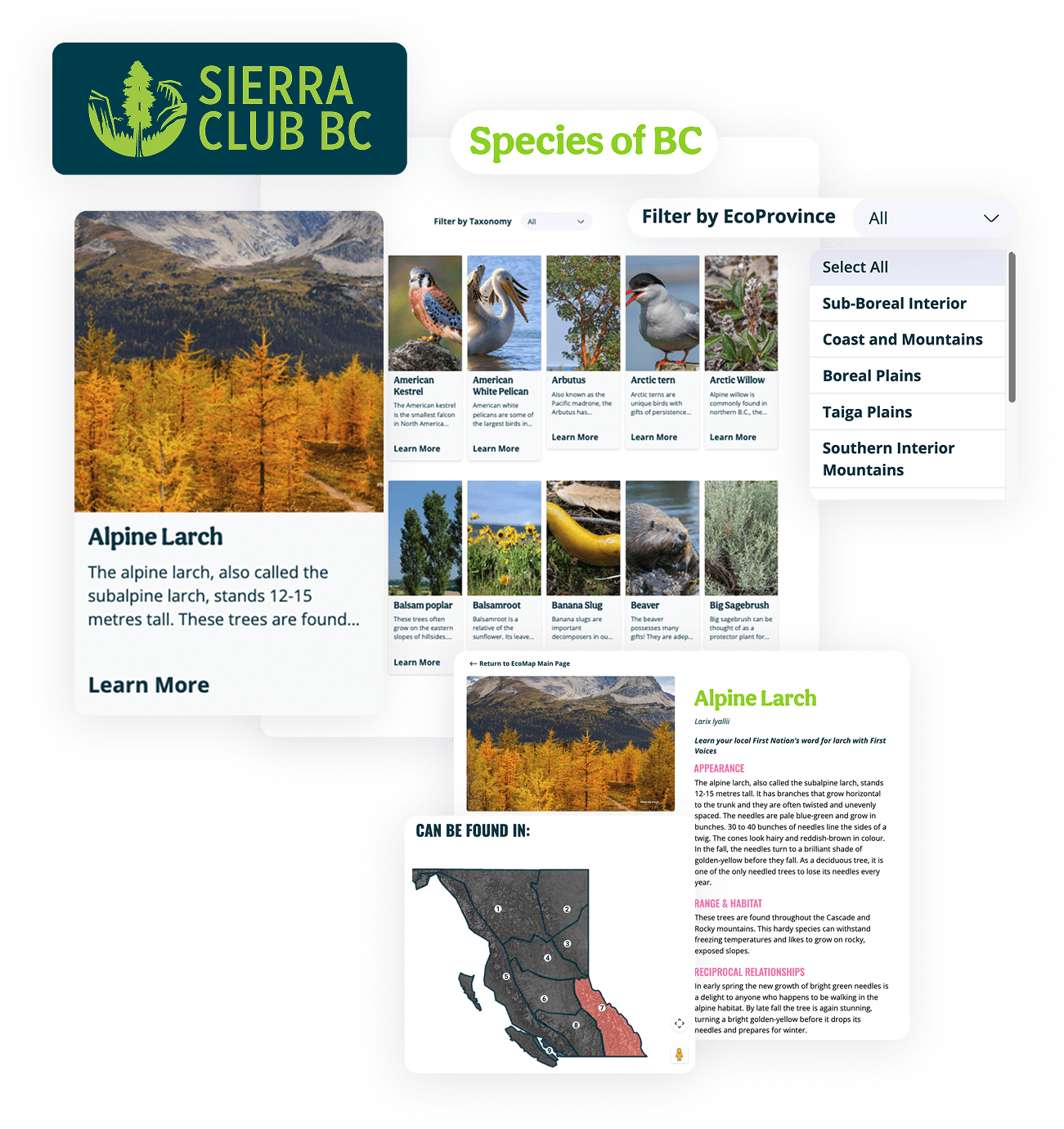
Content and performance audits provided insight - the EcoMap educational resource was a major opportunity to direct traffic through the site, as it was the most visited page on their existing site. Pleasing the user means pleasing the client.
Requirements gathering for an information dense content management system can go in different directions, so communication is everything when distilling business requirements from our clients. Business strategy flows and early sitemap visuals proved invaluable.
We wanted to build a design system/library that represented their overall content structures and organizational goals, while being true to their new branding.
The ability for SCBC’s media team to help design and build out their own site was essential. But in order to help visualize the entirety of the project, SCBC and Acorn needed to embark on a collaborative wireframing journey. After drafting wireframes for selected key components, the SCBC team was able to wireframe the rest of their site by reconfiguring these components with varying content. WordPress Gutenberg page builder fit the bill perfectly.


Our design efforts took two paths: collaborative front-end page building with Gutenberg blocks and customized enhancements on the EcoMap feature.
Data visualization. We boosted the user experience of their EcoMap feature by promoting interactivity over static assets, focusing more value on high traffic features, and making the user’s learning experience delightful. Our hopes were to increase user engagement with the EcoMap even further.
After getting the WordPress style guide in sync with the new branding, we repeated our collaborative workflow of building out and styling content blocks in Gutenberg so that SCBC could then take the ball and run with it, fleshing out the remainder of the processes.
To ease content entry and boost SCBC’s administrative experience with their future site we provided technical support, consultations for UX best practices and training videos.


This project was unique because with clients building out high volumes of pages (using their informed subject matter expertise) we needed to have a testing strategy that factored in their requirements.
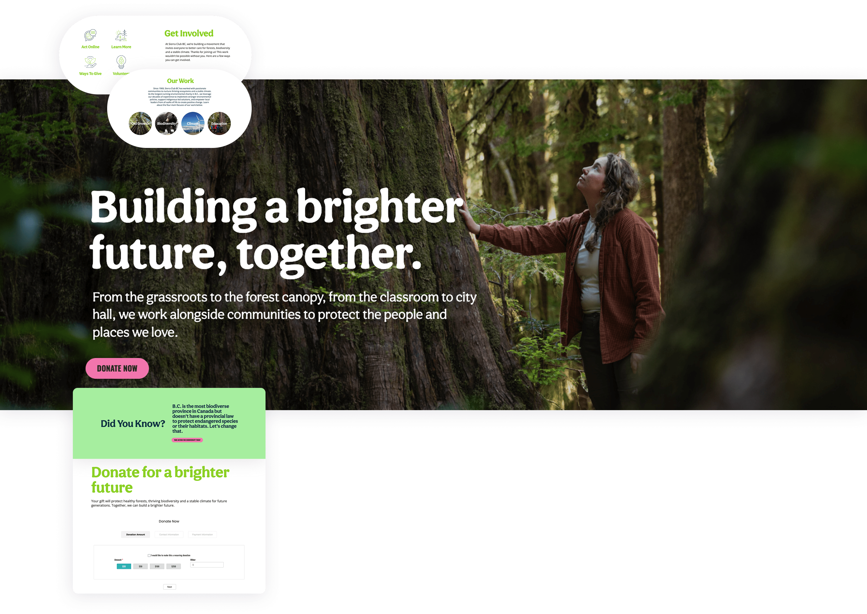
As a user looking to donate, this should be an extremely intuitive and frictionless experience. As a non-profit organization, SCBC wishes the same. A smooth transition to a new website while keeping SCBC’s existing donation system intact was integral.
Testing became a function of communication: which mission-critical features on the pages they were building needed to be prioritized in our testing?

What’s the result? All integrations successfully online with migrated data. A modern website with all integrations successfully online with migrated data. Users can visit the site and easily find what they were looking for, while learning so much more along the way!
Through client training, the marketing & communications teams can make front end changes themselves at any time they want, responding to upcoming campaigns, events, etc.
They have an enhanced EcoMap feature to better support the educational user experience on their most visited page, while offering more pathways to their donation flows.
Technologies used:
Composer, Github actions, Bedrock WordPress, Wordpress Gutenberg, Redis Caching, Google Sitekit, Accessibility Checker, Integrated existing Gravity Forms / Causeview + Salesforce / Newmode
© 2026 All Rights Reserved
Acorn Interactive Inc.

