A Case Study:
Vancouver Art Gallery
The Vancouver Art Gallery is the largest and most respected art institution in Western Canada, with a recent brand refresh, innovative cultural and educational programming and an exciting move to a custom-designed building on the horizon. Their decade-old website didn’t reflect any of this. The new site had to present a huge quantity and variety of information in a way that was thorough, intuitive, and of course, beautiful.


DISCOVERY
In collaboration with the gallery’s marketing and design team,
we began with extensive research to understand how North America’s most prestigious art institutions balanced tradition, innovation and accessibility in their online presence, we identified key opportunities for the website to drive revenue not just through admissions, but also by highlighting the gallery’s numerous community and educational initiatives such as art rental and sales. We also reviewed the gallery’s extensive content archive to determine what was most important and how we could make it shine.
Information Architecture & User Experience
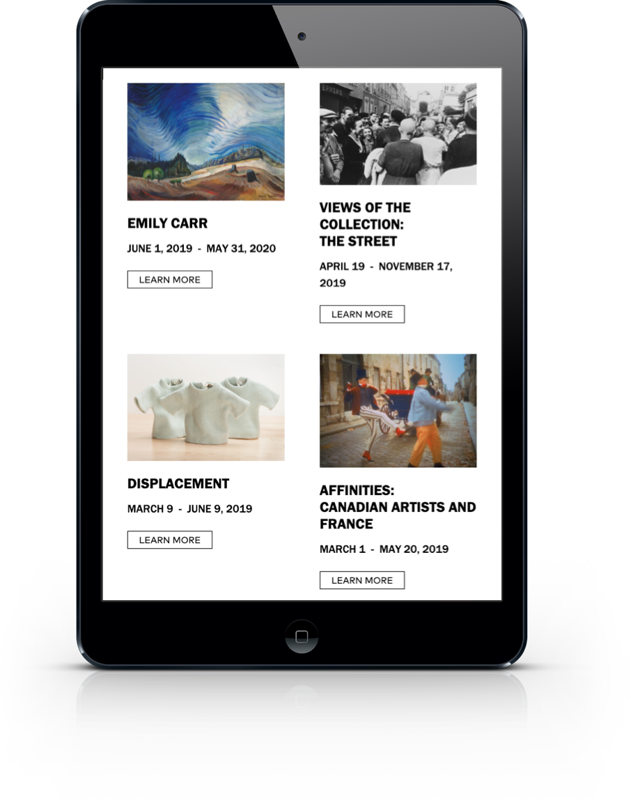
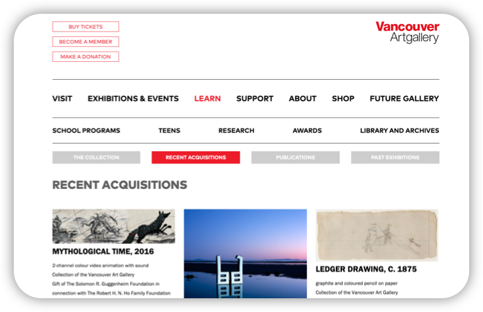
The first and perhaps largest challenge we faced was in organizing the wide variety
of content that needed to live on the site--everything from past, current and future exhibitions to weekly children’s programming to member information, concert series’ and fundraising--in a cohesive and compelling way. With so many different audiences relying on the site, navigation needed to be crystal clear so each user landing on the homepage knew immediately how to get where they were going.

Design & Prototyping
Front of mind throughout the design process
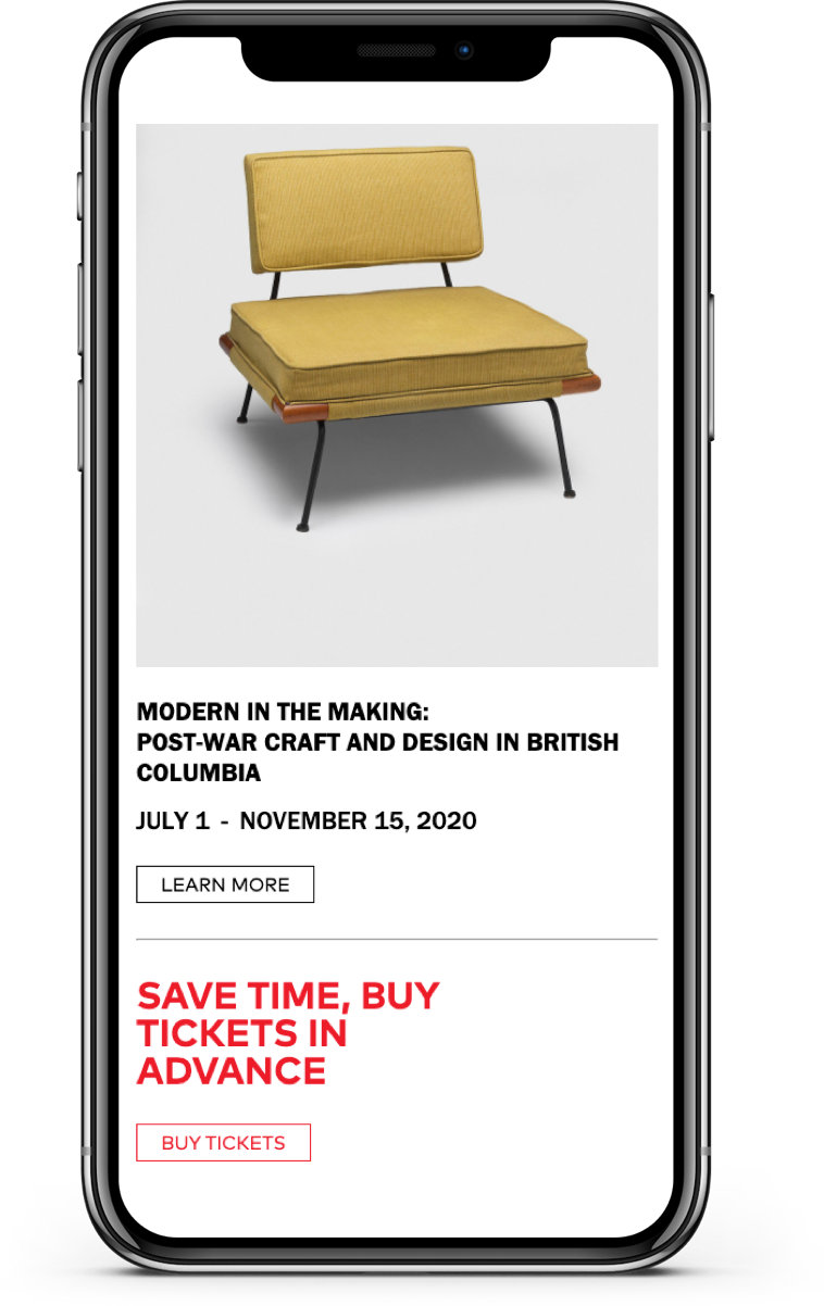
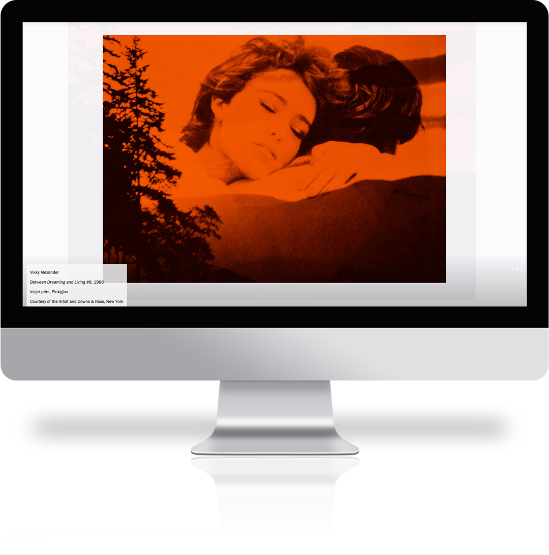
was the photography department’s directive that images of artwork must never be cropped. The aspect ratio the photo department sent was the aspect ratio you used. With content added almost daily, this meant the designs had to accommodate any aspect ratio, without requiring any additional work from staff. For the prototyping phase, we collected as many different variations of artwork, titles and descriptions to weed out any hiccups and prevent unpleasant surprises down the road.

Development & Databasing
The end result needed to be robust, extensible, and usable by multiple stakeholders,
therefore we selected Wordpress, for it’s familiar dashboard, reliable database and out-of-the-box user access controls, and React, for its modular structure and modern technology. To streamline the web application’s server side rendering (SSR) and improve Search Enging Optimization (SEO) , our React was served with Next.js and Express.js. This stack allowed us to create a variety of flexible, reusable components to showcase many different types of content while holding true to the gallery’s brand identities.

Conclusions & Insights
The result is a bold, clean, art-forward interface that draws in users from a diverse range of demographics and creates seamless paths through their high-quality content. The site sparks engagement with programming and drives revenue through multiple avenues, including annual memberships, events, and sales.
Technologies Used:
React, Next.js, Express.js, WordPress, Headless CMS, Nginx, Tailwind CSS, core-js, Node.js, Google Analytics
